lionesses consolation
sportbible
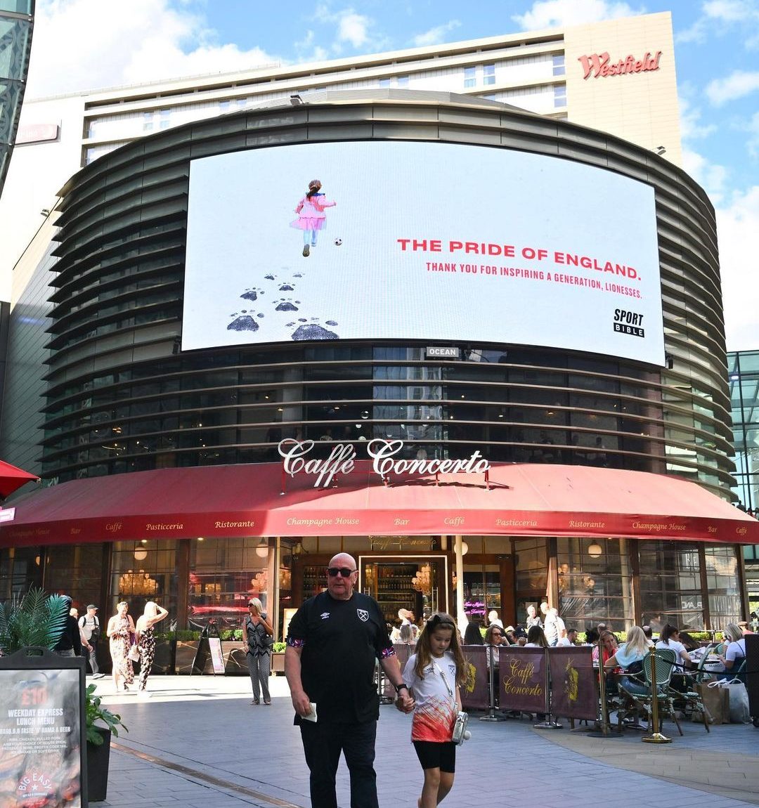
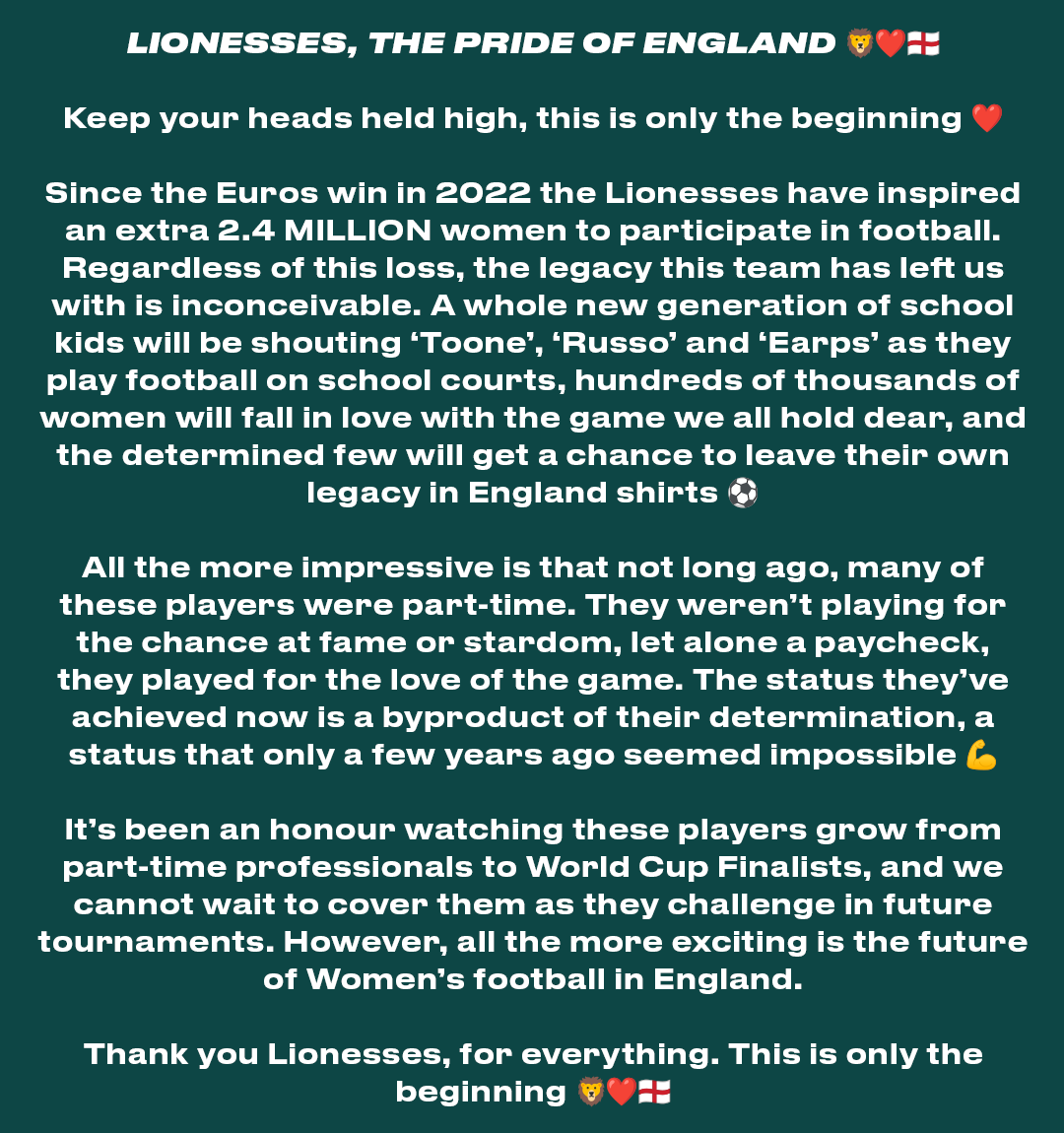
A reactive brand piece to the Lionesses’ loss in the Women’s World Cup Final.
As part of our commitment to women’s football, we wanted to draw attention away from the result and focus more on celebrating the legacy created by the Pride.
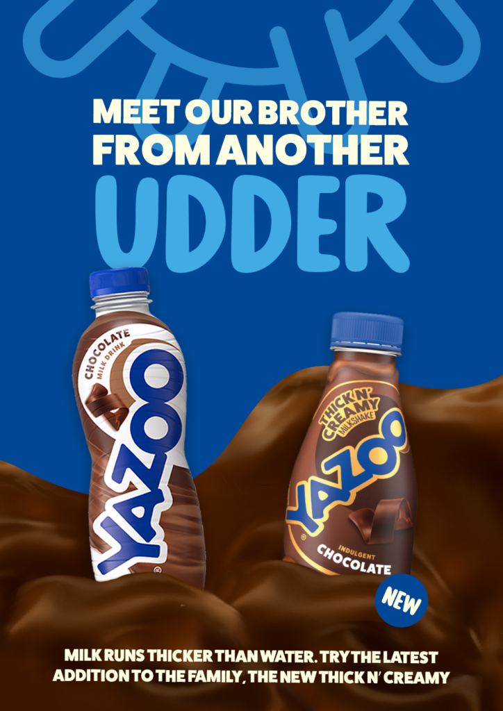
Yazoo thick n' creamy
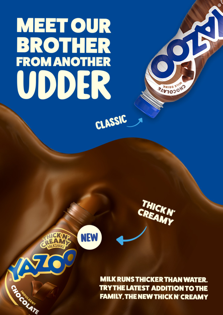
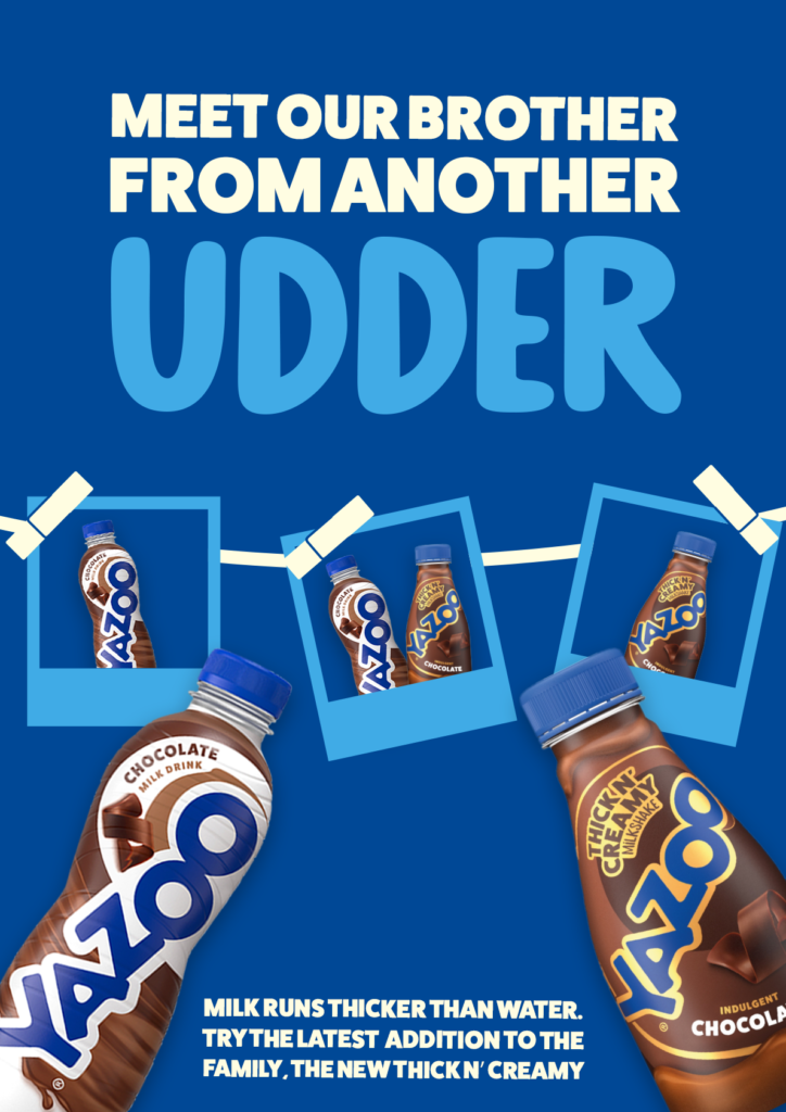
When Yazoo approached us looking for a fun way to introduce and distinguish their new Thick and Creamy Milkshake range, I was set the task of writing for an OOH that made it clear there was a new range of shakes available, but they weren’t replacing the classics.
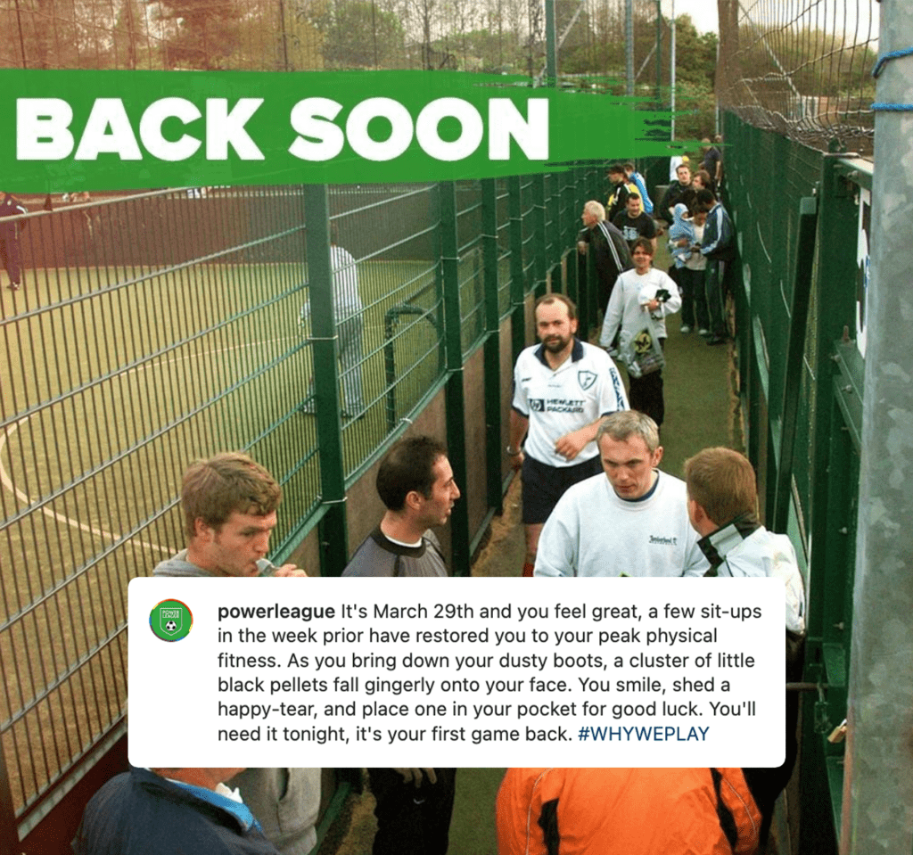
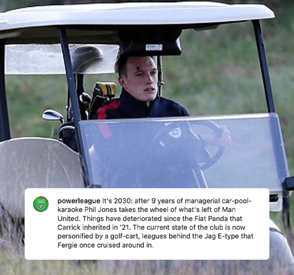
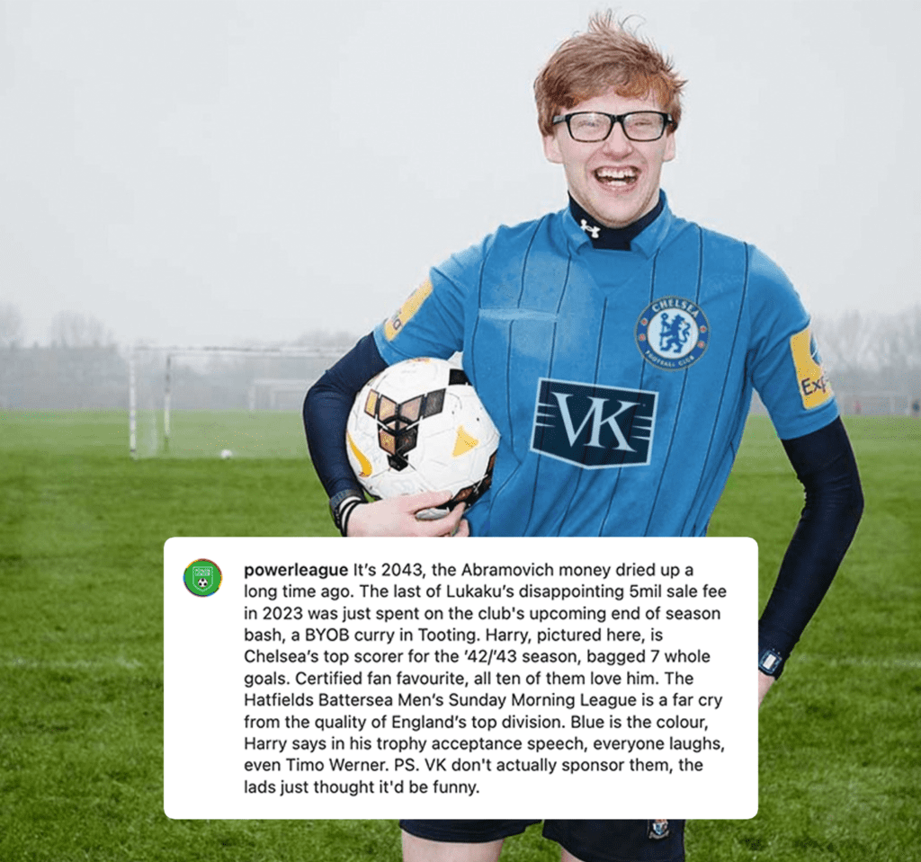
the 'its' social series
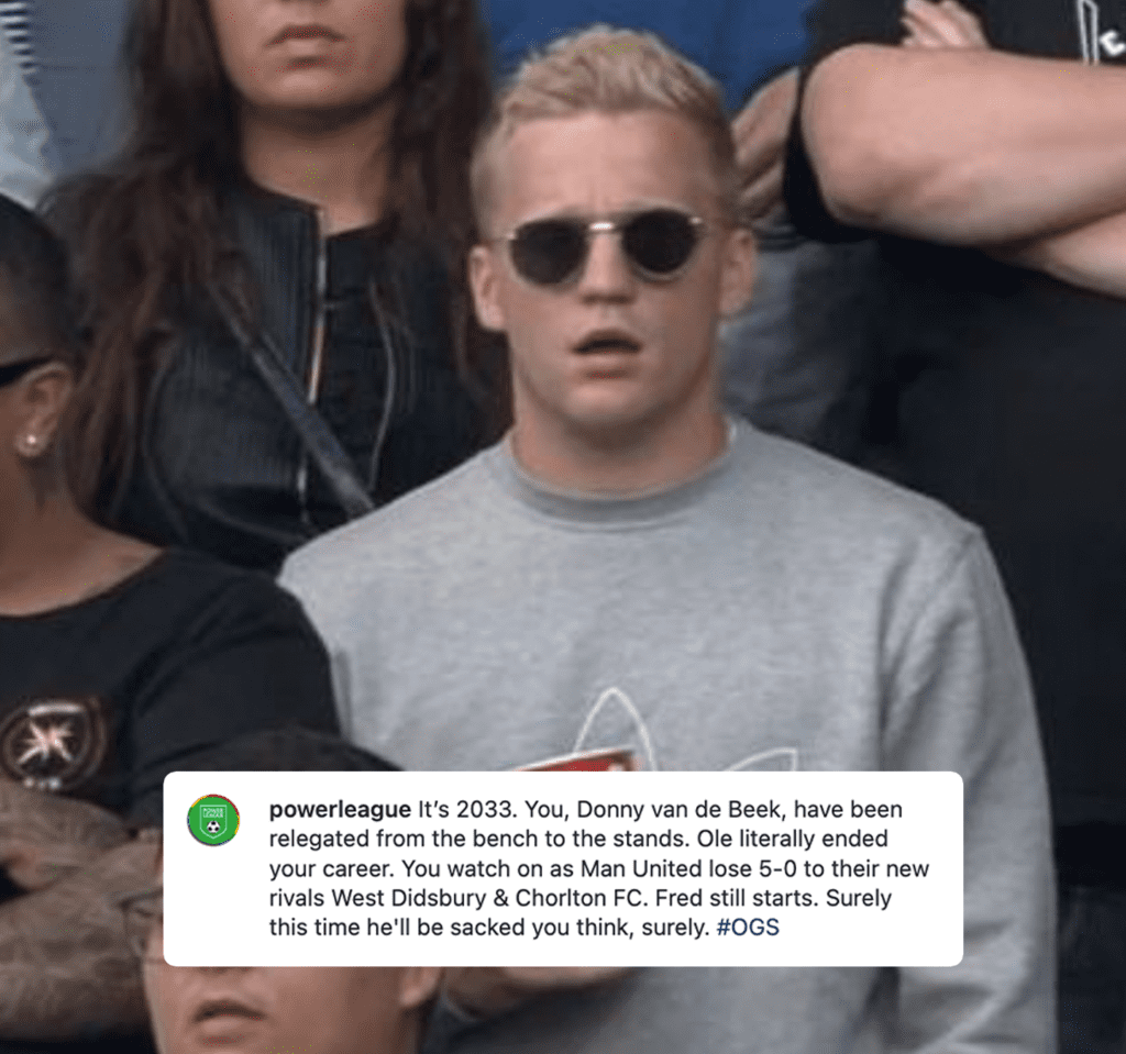
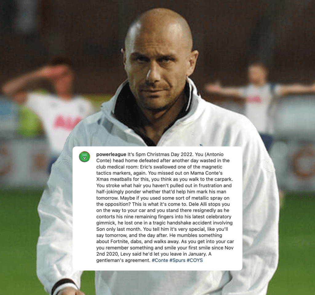
A reactive content series based on day-to-day trends in the football world.
These satirical posts were the best-performing content series on the Powerleague Instagram.
The Donny van de Deek post (4) is the most liked in the page’s history with 965.
WEB COPY
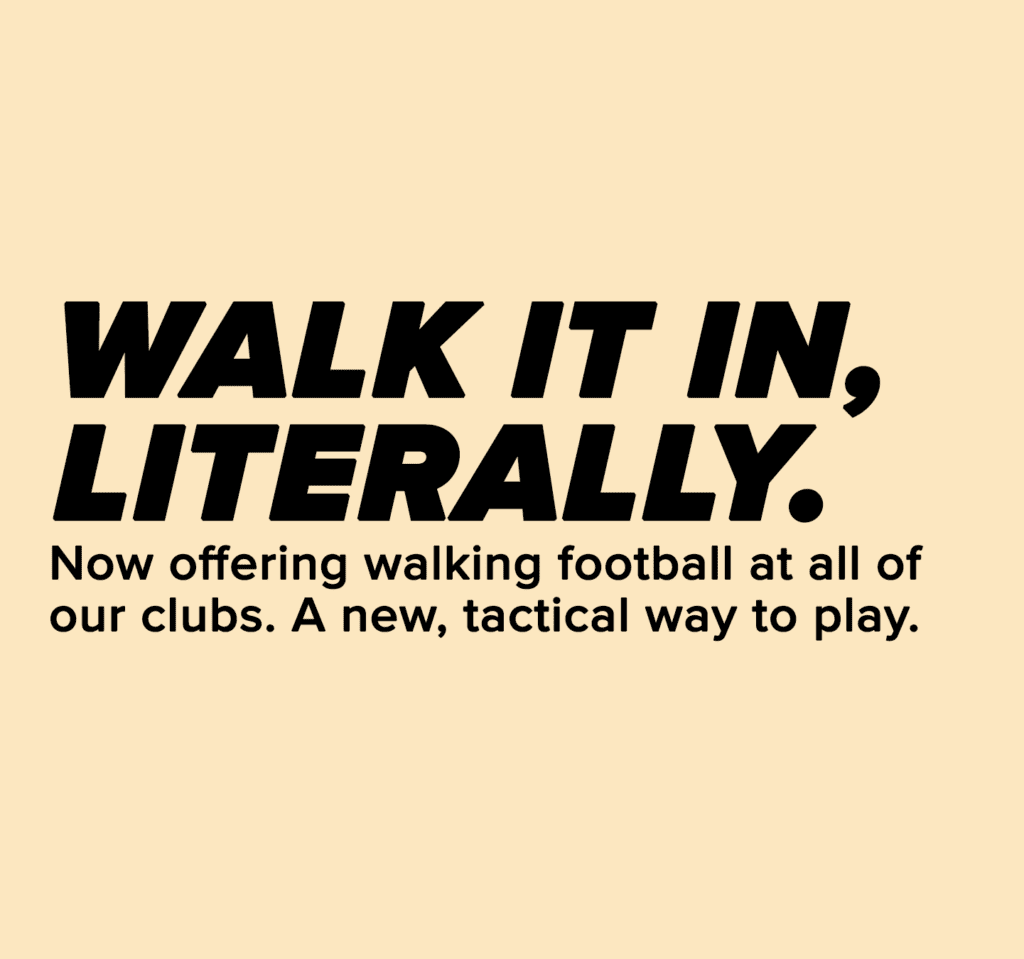
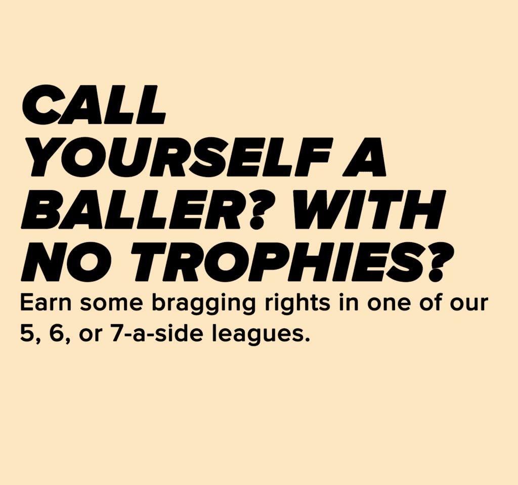
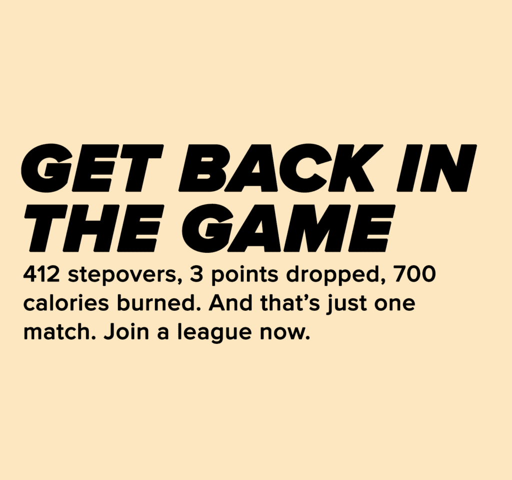
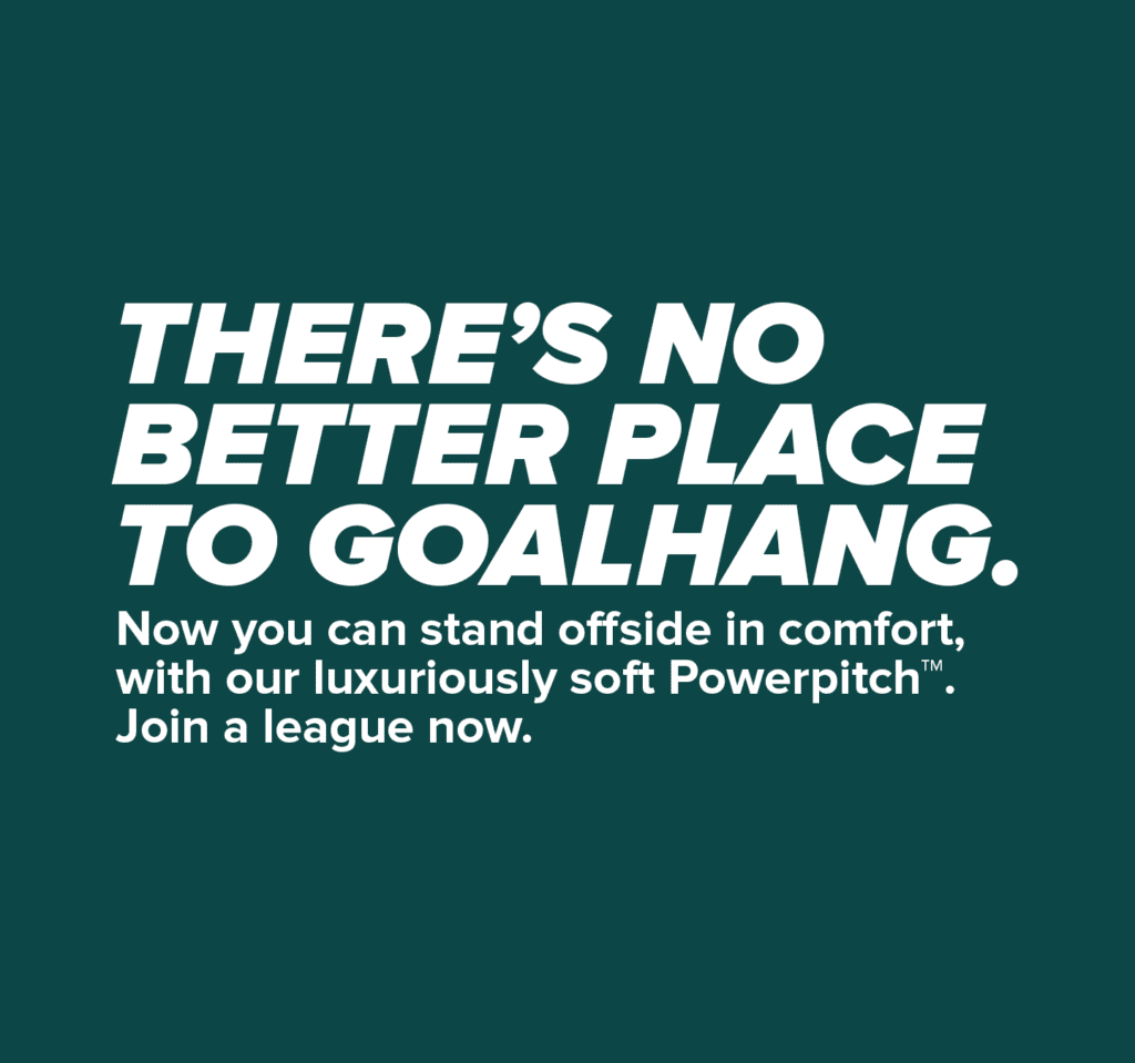
Following the Powerleague re-brand, we had to update all web-copy to align with the new brand guidelines.
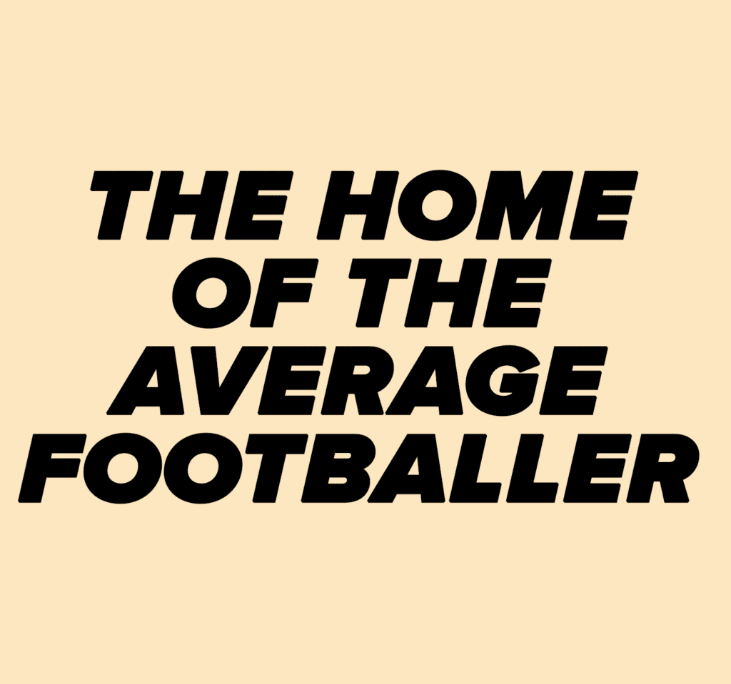
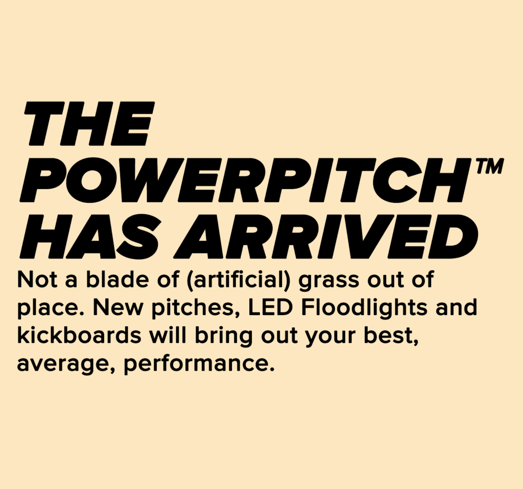
To the right is a selection of tongue-in-cheek head and sub-headers I wrote following the brand tone of voice project.
They utilise the humour found down at 5-a-side football sites, and draw inspiration from the amateur nature of small-sided football.
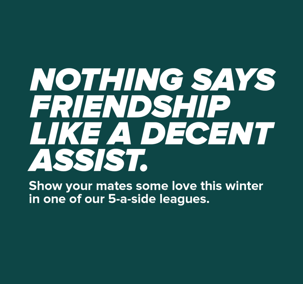

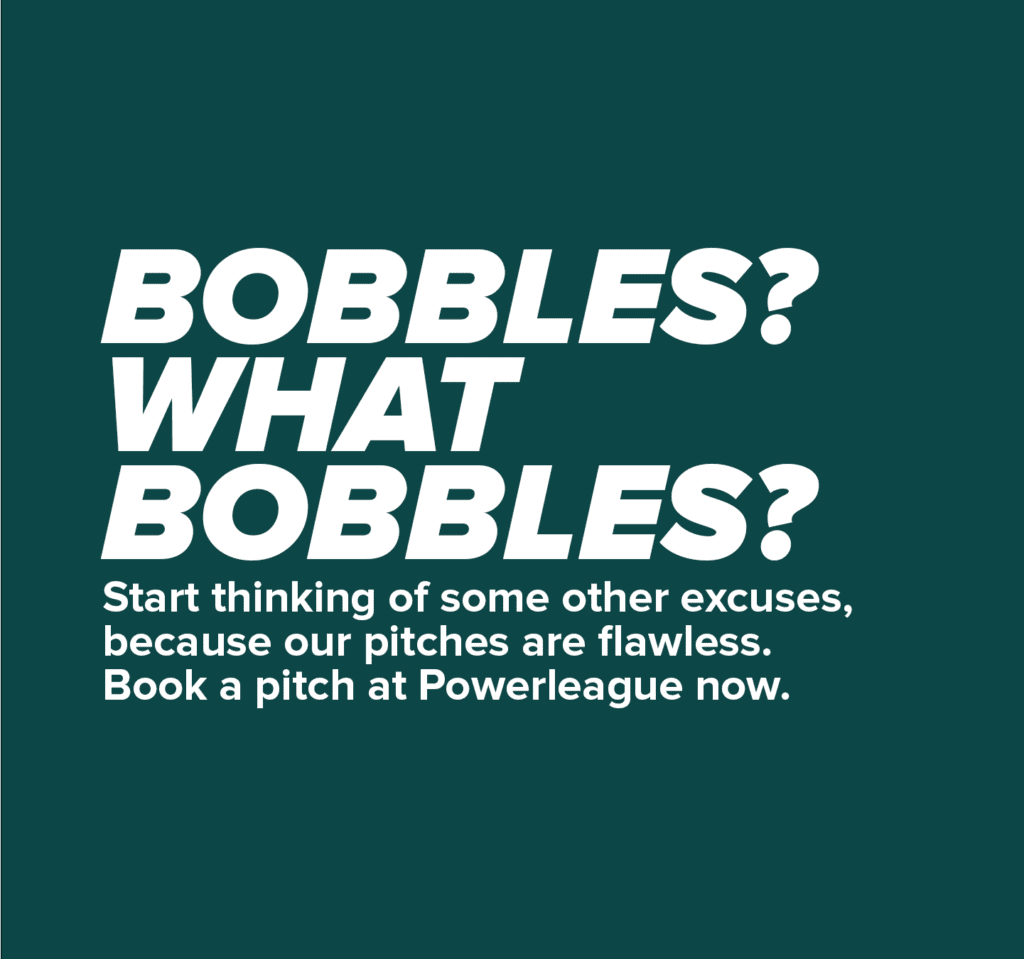
AD COPY
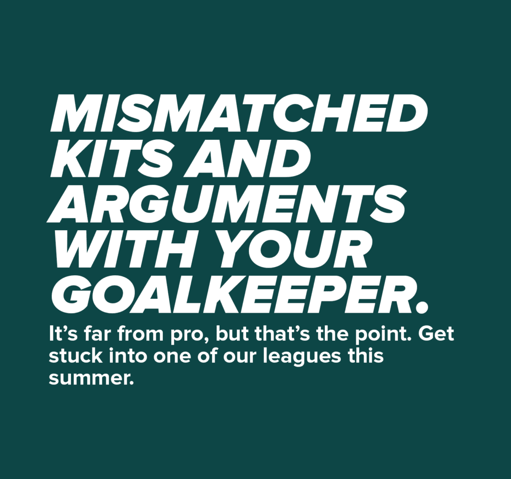
A selection of taglines for our paid social media ads.
The copy plays on the truisms of five-a-side football to demonstrate our understanding of the game, and speak the language of our customers.
After switching from generic sales led copy to this style of writing, our click through rates increased significantly.
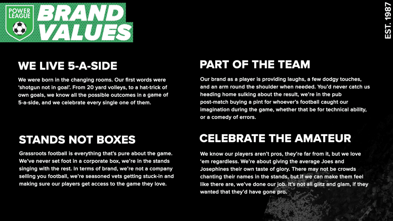
PL BRAND VALUES
The Powerleague brand values had to celebrate the amateur game, and the camaraderie that came with it.
To do this I thought of the 5-a-side experience as a whole, not just the game. it’s a lot more than that.
maaate
campaign
ladBIBLE
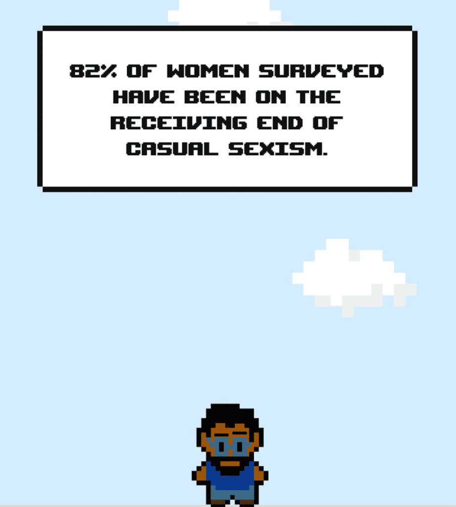
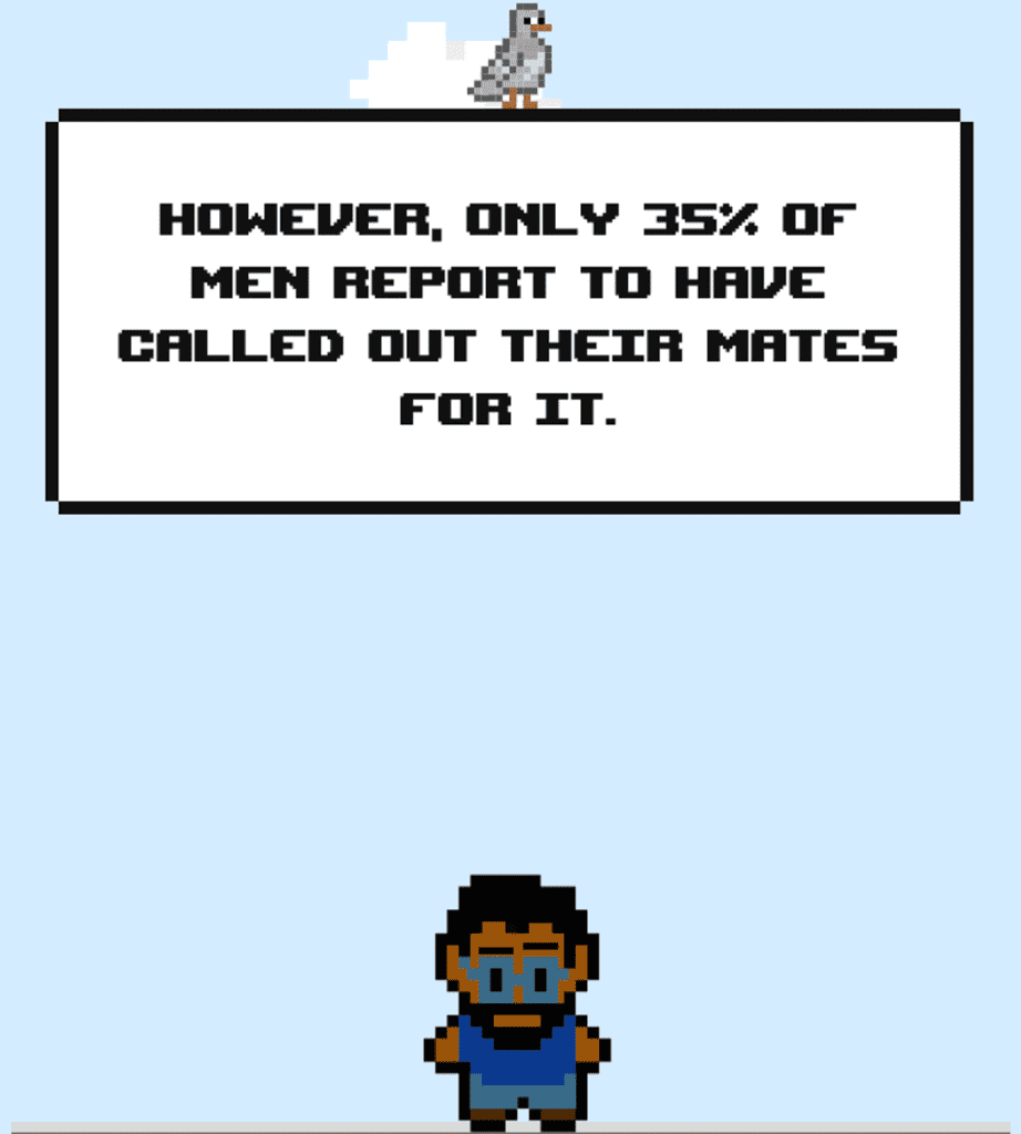
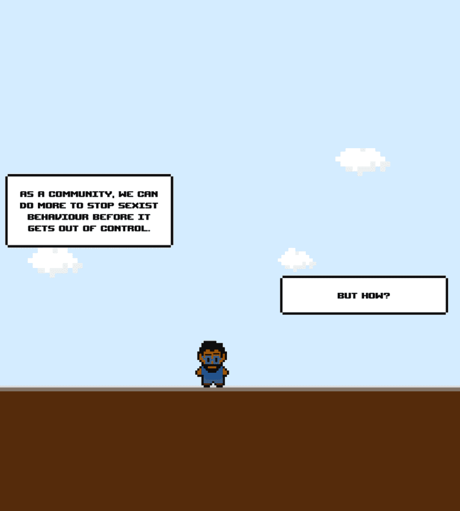
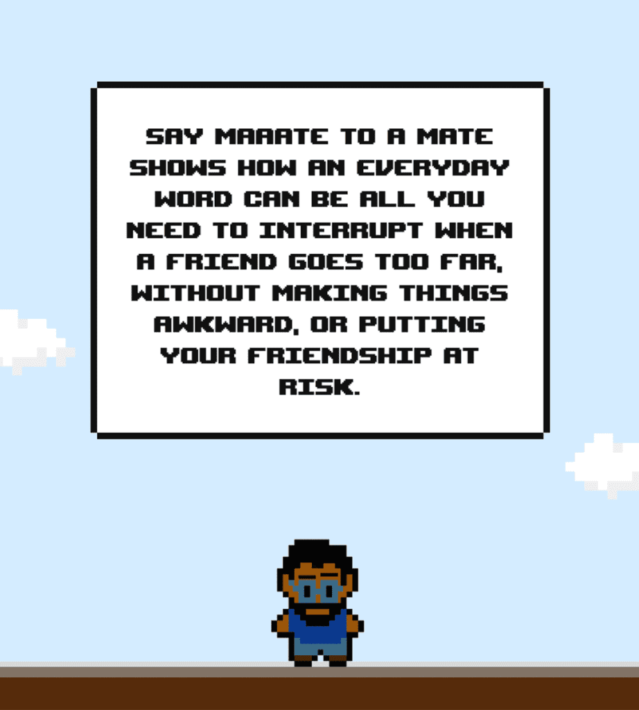
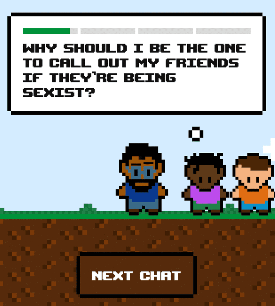
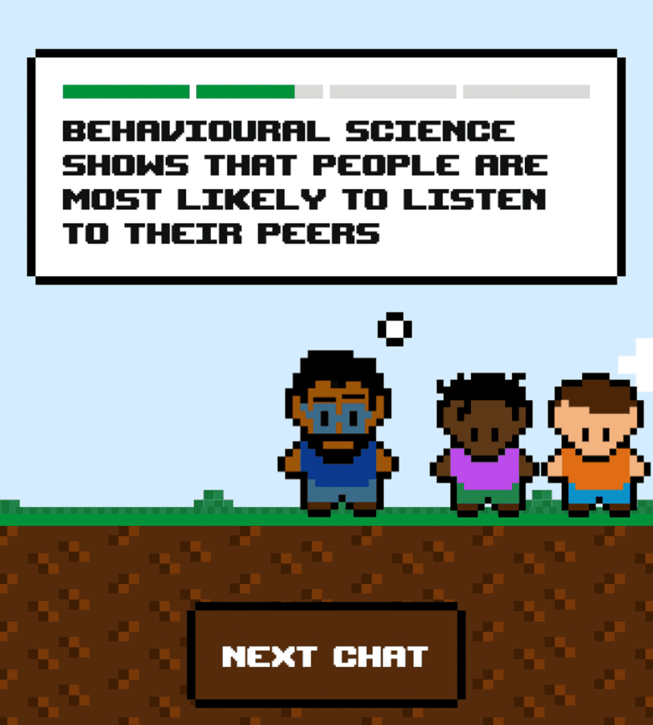
Working in partnership with the Mayor of London office, we launched a campaign calling on men to challenge their mates on sexist behaviour.
The copy-brief was to deliver the statistics from our surveys to the audience in a digestible yet matter-of-fact manner. I delivered this by breaking the copy down into bitesize chunks, which were then spread along the user journey.
The images to the right are screen grabs taken from the animated campaign hub, which sat on the LADbible website.
